Code
library(tidyverse)
library(janitor)
library(lubridate)
library(gghighlight)
library(ggrepel)
library(ggridges)
library(rvest)With all this talk about marathon world records being broken, I wanted to do some visualization of marathon finishing times through the years. The Boston Marathon is such a classic race that has been ran since 1897 so that would give us plenty of data to play around with.
library(tidyverse)
library(janitor)
library(lubridate)
library(gghighlight)
library(ggrepel)
library(ggridges)
library(rvest)url <- "https://github.com/adrian3/Boston-Marathon-Data-Project"
links <- url %>%
read_html() %>%
html_nodes(xpath = '//*[@role="rowheader"]') %>%
html_nodes('span a') %>%
html_attr('href') %>%
sub('blob/', '', .) %>%
paste0('https://raw.githubusercontent.com', .)
links <- links[!str_detect(links,pattern="README")]
links <- links[!str_detect(links,pattern="_without-diverted")]
links <- links[!str_detect(links,pattern="_includes-wheelchair")]
data <- list()
for (i in links){
data[[i]] <- read_csv(i,col_types = cols(.default = col_character()))
}Warning: One or more parsing issues, see `problems()` for detailsdata2 <- data[2:length(data)] %>%
bind_rows(.id = 'id') %>%
mutate(id=sub(".*(\\d{4}).*", "\\1", id),
id = as.integer(id),
display_name = as.factor(display_name),
age = as.numeric(age),
gender = as.factor(gender),
gender_result=factor(gender_result),
division_result = factor(division_result),
first_name = factor(first_name),
last_name = factor(last_name),
official_time = hms(official_time),
official_time_seconds = as.numeric(seconds(official_time)))Warning in mask$eval_all_mutate(quo): NAs introduced by coercionWarning in .parse_hms(..., order = "HMS", quiet = quiet): Some strings failed to
parse, or all strings are NAsLets take a peak at the messy data:
data2# A tibble: 615,953 × 32
id display_name age gender residence pace official_time overall
<int> <fct> <dbl> <fct> <chr> <chr> <Period> <chr>
1 1898 Ronald MacDonald 22 M Canada 6:36 2H 42M 0S 1
2 1899 Lawrence Brignolia 23 M Boston, MA 00:07… 2H 54M 38S 1
3 1900 John P Caffrey 0 M <NA> 00:06… 2H 39M 44S 1
4 1900 William Sheering 0 M <NA> 00:06… 2H 41M 31S 2
5 1900 Fred Hughson 0 M <NA> 00:06… 2H 49M 8S 3
6 1900 John B Maguire 0 M <NA> 00:06… 2H 51M 36S 4
7 1900 James Fay 0 M <NA> 00:06… 2H 55M 7S 5
8 1900 Thomas J Hicks 0 M <NA> 00:07… 3H 7M 19S 6
9 1900 B F Sullivan 0 M <NA> 00:07… 3H 13M 20S 7
10 1900 Richard Grant 0 M <NA> 00:07… 3H 13M 57S 8
# … with 615,943 more rows, and 24 more variables: gender_result <fct>,
# division_result <fct>, seconds <chr>, first_name <fct>, last_name <fct>,
# place_overall <chr>, bib <chr>, name <chr>, city <chr>, state <chr>,
# country_residence <chr>, contry_citizenship <chr>, name_suffix <chr>,
# `5k` <chr>, `10k` <chr>, `15k` <chr>, `20k` <chr>, half <chr>, `25k` <chr>,
# `30k` <chr>, `35k` <chr>, `40k` <chr>, projected_time <chr>,
# official_time_seconds <dbl>Now that we’ve managed the data into a usable format, lets ask the simple question of how has the average finishing time through the years changed? Surely since the late 1890s there has been some change.
year_avg_finish_time <- data2 %>%
  # Averaging into year and calculating standard error
  group_by(id) %>%
  select(id,official_time_seconds) %>%
  summarize(avg_finish_time = mean(official_time_seconds/60^2,na.rm = TRUE),
            avg_finish_time_se = sd(official_time_seconds/60^2)/sqrt(length(official_time_seconds)),
            total_runners = n())

year_avg_finish_time
# A tibble: 122 × 4
id avg_finish_time avg_finish_time_se total_runners
<int> <dbl> <dbl> <int>
1 1898 2.7 NA 1
2 1899 2.91 NA 1
3 1900 2.94 0.0800 8
4 1901 2.86 0.0402 9
5 1902 3.11 0.0639 12
6 1903 2.98 0.0510 10
7 1904 2.76 0.0275 10
8 1905 2.78 0.0342 10
9 1906 3.00 0.0391 13
10 1907 2.58 0.0286 10
# … with 112 more rowsyear_avg_finish_time %>%
ggplot(aes(x=id,y=avg_finish_time)) +
geom_point() +
geom_errorbar(aes(ymax=avg_finish_time+avg_finish_time_se,ymin=avg_finish_time-avg_finish_time_se))+
geom_smooth(method='gam',se=FALSE) +
ylab("Hours") +
xlab("Year") +
theme_bw(base_size=13)`geom_smooth()` using formula 'y ~ s(x, bs = "cs")'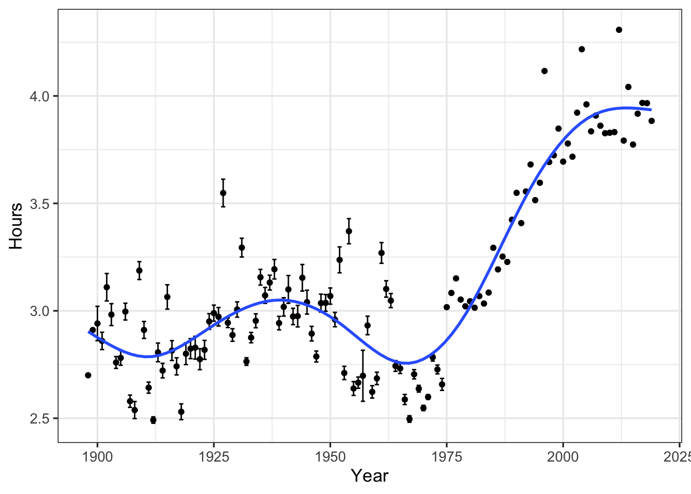
Without knowing anything about the Boston Marathon or the progression of marathon times, one might make the conclusion that times on average are getting slower! As always, summarizing into means/standard errors can lead to masking important elements of the data! Lets plot the rawest form to see what is actually happening:
data2 %>%
  select(id, official_time_seconds) %>%
  mutate(official_time_hours = official_time_seconds/60^2) %>%
  group_by(id) %>%
  mutate(avg_year_hour = mean(official_time_hours,na.rm=TRUE)) %>%
  ggplot(aes(x=id,y=official_time_hours)) +
    geom_point(pch=21,alpha=0.6,size=0.5) +
    geom_point(aes(y=avg_year_hour),color='red',size=1) +
    ylab("Hours") +
    xlab("Year") +
    theme_bw(base_size=13)  +
    ggtitle("Average hours to complete the Boston",
          subtitle= "Red dot represents mean finishing time")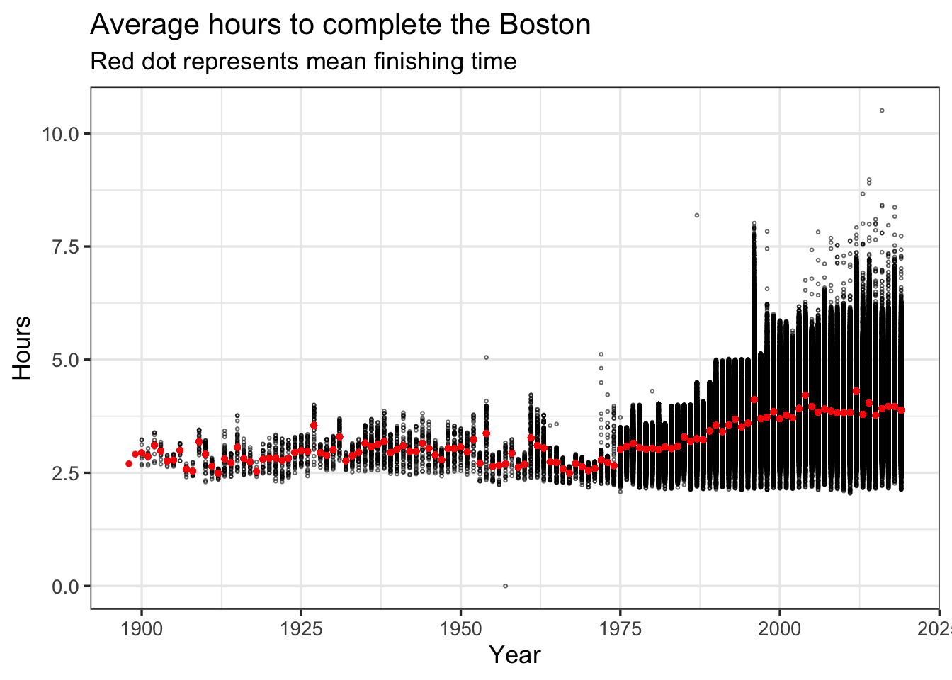
Now we can see that average completion time increased because more runners of varying speeds ran the boston marathon, particularly after 1975. You can also see that the first place finish time has trended lower through the years. One other visualization trick is handy: ridgeline plots. Basically I will build a specific density line per year and plot them into one figure:
data2 %>%
  select(id, official_time_seconds) %>%
  mutate(official_time_hours = official_time_seconds/60^2) %>%
  # Just for sanity I am filtering out finishing times > 8 hours and one obvious outlier
  filter(between(official_time_hours,2,8)) %>% # There are some extreme values
  ggplot(aes(y=reorder(factor(id),-id),x=official_time_hours)) +
    geom_density_ridges2() +
    theme_bw(base_size = 20) +
    ylab("") +
    xlab("Hours") +
    ggtitle("Density ridges of completion times by year")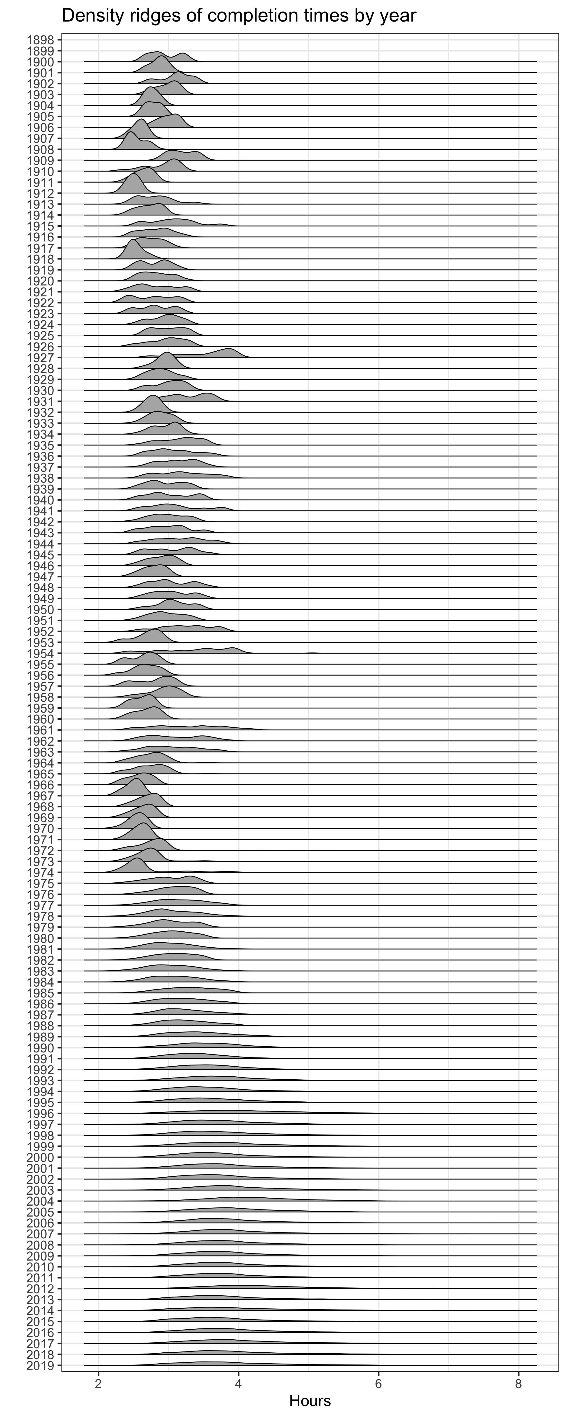
So interesting. The average finishing time has increased over time but that is largely because there are a lot more runners (at least that are reported in this dataset) especially starting in the 1970s. I’ve shown you this three different ways to demostrate that if you’re not careful you can make erroneous conclusions!
So why all the sudden increase in runners? One suggestion I have off the top of my head is that running became really popular in the 70s. So in addition to competitive athletes there were now fitness and casual runners racing the Boston Marathon.
IF you look closer at the first place times per year appears to be decreasing with time. Lets filter out just the first place male and female runners
data2 %>%
  group_by(id,gender) %>%
  mutate(gender_result = as.numeric(gender_result)) %>%
  filter(gender_result <= 1,official_time_seconds > 0,gender != "U") %>%
  ggplot(aes(x=id,y=official_time_seconds/60^2,color=gender)) +
    geom_point() +
    geom_smooth(method="gam",se=FALSE) +
    #geom_smooth(method="loess",linetype=2,se=FALSE) +
    theme_bw(base_size = 15) +
    xlab("") +
    ylab("Hours") +
    ggtitle("First place Boston Marathon finishing times") +
    MetBrewer::scale_colour_met_d(name="Degas")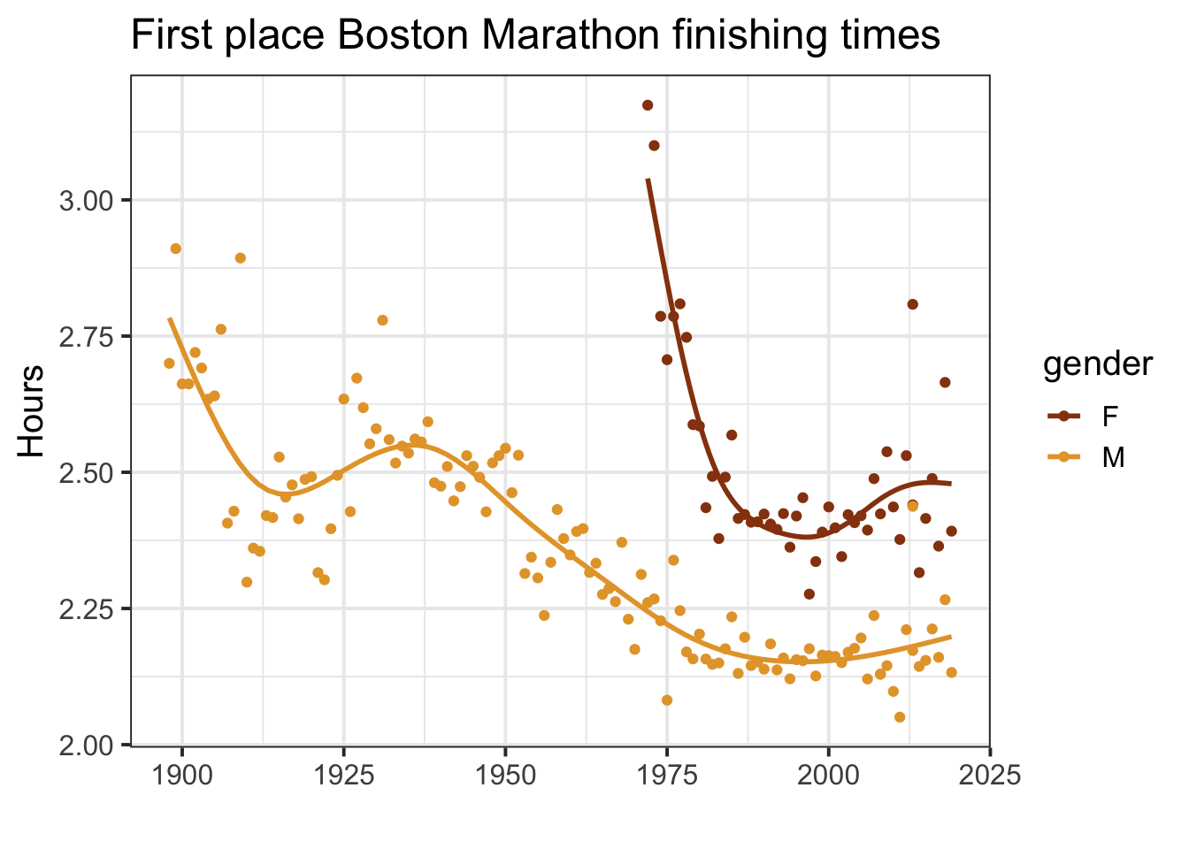
There is clearly non-linear patterns for both the male and female finishing times. Both seem to ‘bottom’ out starting around 1980 with some small up-ticks going into the 2010s. I wouldn’t look too much into this especially the female results as there is a lot of variation in finishing times – maybe due to differing race day weather conditions.
I found it also interesting to see the dramatic drop in finishing times around 1910 but then a gradual increase into the 1940s.
This dataset also includes several mid-race times every 5 kilometers from 5k to 40k as well as the half marathon split. I’m curious to see how well we can predict the finishing time of all runners based on their first 5 kilometers of the race. You can imagine there would be quite a variation in the first 5k due to people running way too fast and then slowing down further into the race. I bet that the elite runners first 5k time will be a stronger predictor than more ‘casual’ (although still very fast!) runners. Sadly, we only have this data starting in 2015 however there are still plenty of runners per year (n ~ 26,000).
pace_times <- data2 %>%
  select(1,2,4,8:11,22:30,official_time_seconds) %>%
  drop_na() %>%
  mutate(seconds = as.numeric(official_time_seconds),
         across(8:16,hms),
         `5k` = seconds(`5k`),
         `10k` = seconds(`10k`),
         `15k` = seconds(`15k`),
         `20k` = seconds(`20k`),
         half = seconds(half),
         `25k` = seconds(`25k`),
         `30k` = seconds(`30k`),
         `35k` = seconds(`35k`),
         `40k` = seconds(`40k`),
across(8:16,as.numeric))flevels <- c("5k","10k","15k","20k","half","25k","30k","35k","40k")
pace_times %>%
pivot_longer(cols=8:16) %>%
mutate(name = factor(name,levels=flevels)) %>%
ggplot(aes(x=value,y=seconds)) +
geom_abline(slope=1,linetype=2,size=1,color="red") +
geom_point(alpha=0.2,size=0.5,pch=1) +
geom_smooth(method="gam",se=FALSE) +
theme_bw(base_size=10) +
expand_limits(x = 0, y = 0) +
facet_wrap(~name,ncol=2,scales="free_x") +
ylab("Finishing time (in seconds)") +
xlab("Split time (in seconds)") +
ggtitle("Correlation between race splits and finishing times",
subtitle = "Red line: 1:1 correlation")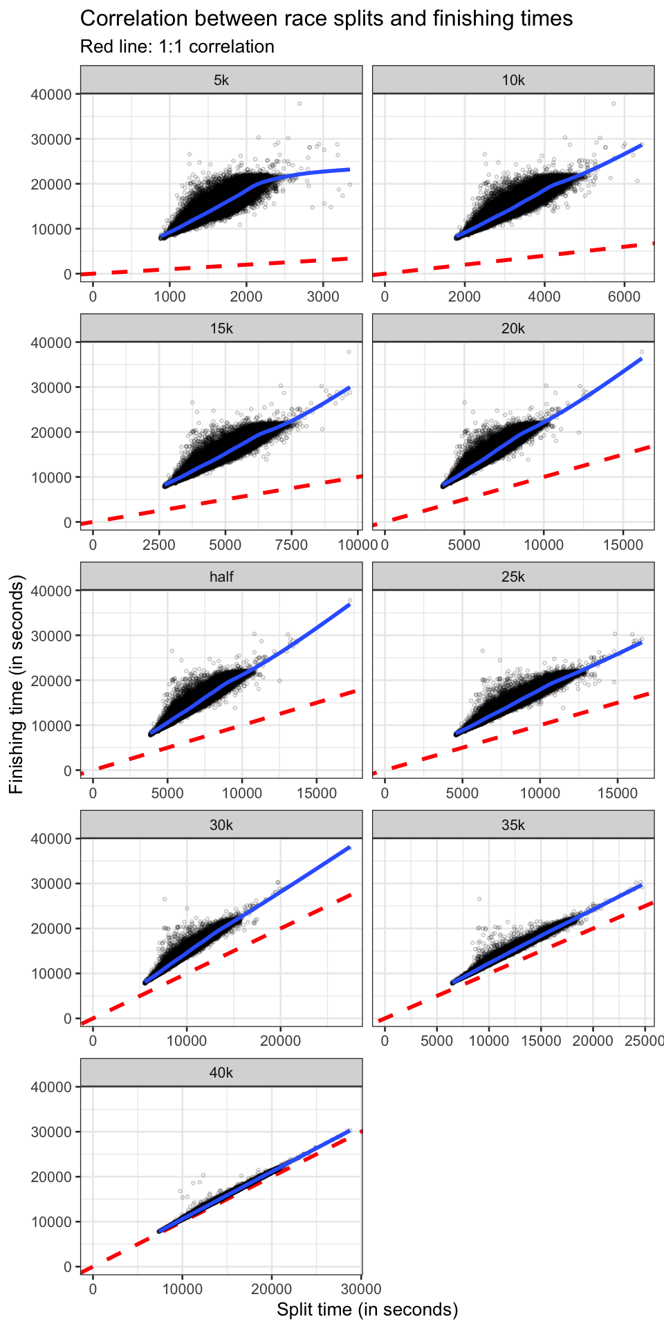
If runners maintained their pace throughout the entire run, you would expect to see a 1:1 relationship between the race split a finishing time. Obviously this isn’t the case due to many variables such as: starting out too fast/slow, elevation gain/loss, change in weather conditions, etc. It is interesting to see the gradual increase in linearity and conforming to the 1:1 line. However even at the 40k split (with ~2km to go) which is pretty close to the 1:1 line, there isn’t an exact correlation suggesting that a lot of variables come into play.
I am curious to group these runners by finishing times. You would expect elite runners to have a greater consistency in terms of splits and finishing times as compared more ‘casual’ runners. Here are five large groups basically splitting into reasonable finishing times going from elites to more casual runners.
<= 2:30:00
2:15:00 - 3:00:00
3:00:00 - 4:00:00
4:00:00 - 5:00:00
> 5:00:00
In the future, I would like to see how to relationship betwen first 5km mark and finishing time correlates between the large groupings from more elite to casual runners.