Code
library(tidyverse)
library(janitor)
library(lubridate)
library(rnaturalearth)
library(sf)
library(gghighlight)
library(ggrepel)This week’s TidyTuesday dataset focuses on waste water treatment plants throughout the world. Going into this, I am curious to make a pretty map showing the distribution overall and perhaps look at amount of treated water breaks down by country. But first, lets load in some basic libraries and the actual dataset from GitHub:
library(tidyverse)
library(janitor)
library(lubridate)
library(rnaturalearth)
library(sf)
library(gghighlight)
library(ggrepel)Now loading in the data as a tibble and looking at the first ten rows.
WWT <- readr::read_csv('https://raw.githubusercontent.com/rfordatascience/tidytuesday/master/data/2022/2022-09-20/HydroWASTE_v10.csv')

WWT %>% head()
# A tibble: 6 × 25
WASTE_ID SOURCE ORG_ID WWTP_NAME COUNTRY CNTRY_ISO LAT_WWTP LON_WWTP QUAL_LOC
<dbl> <dbl> <dbl> <chr> <chr> <chr> <dbl> <dbl> <dbl>
1 1 1 1140441 Akmenes … Lithua… LTU 56.2 22.7 2
2 2 1 1140443 Alytaus … Lithua… LTU 54.4 24.1 2
3 3 1 1140445 Anyksciu… Lithua… LTU 55.5 25.1 2
4 4 1 1140447 Ariogalo… Lithua… LTU 55.3 23.5 2
5 5 1 1140449 Baisogal… Lithua… LTU 55.6 23.7 2
6 6 1 1140451 Birstono… Lithua… LTU 54.6 24.1 2
# … with 16 more variables: LAT_OUT <dbl>, LON_OUT <dbl>, STATUS <chr>,
# POP_SERVED <dbl>, QUAL_POP <dbl>, WASTE_DIS <dbl>, QUAL_WASTE <dbl>,
# LEVEL <chr>, QUAL_LEVEL <dbl>, DF <dbl>, HYRIV_ID <dbl>, RIVER_DIS <dbl>,
# COAST_10KM <dbl>, COAST_50KM <dbl>, DESIGN_CAP <dbl>, QUAL_CAP <dbl>With over treatment plants, there is bound to be a bunch of overplotting here. But lets plot it anyway to see what it looks like:
map_data <- WWT %>%
              dplyr::select(1,4:8) %>%
              st_as_sf(coords=c("LON_WWTP","LAT_WWTP"), crs=4326) %>%
              mutate(longitude = st_coordinates(.)[,1],
                     latitude = st_coordinates(.)[,2])

world <- ne_countries() %>%
            st_as_sf()

ggplot(world) +
    geom_sf() +
    geom_sf(data=map_data,size=0.05,alpha=0.3) +
    theme_void()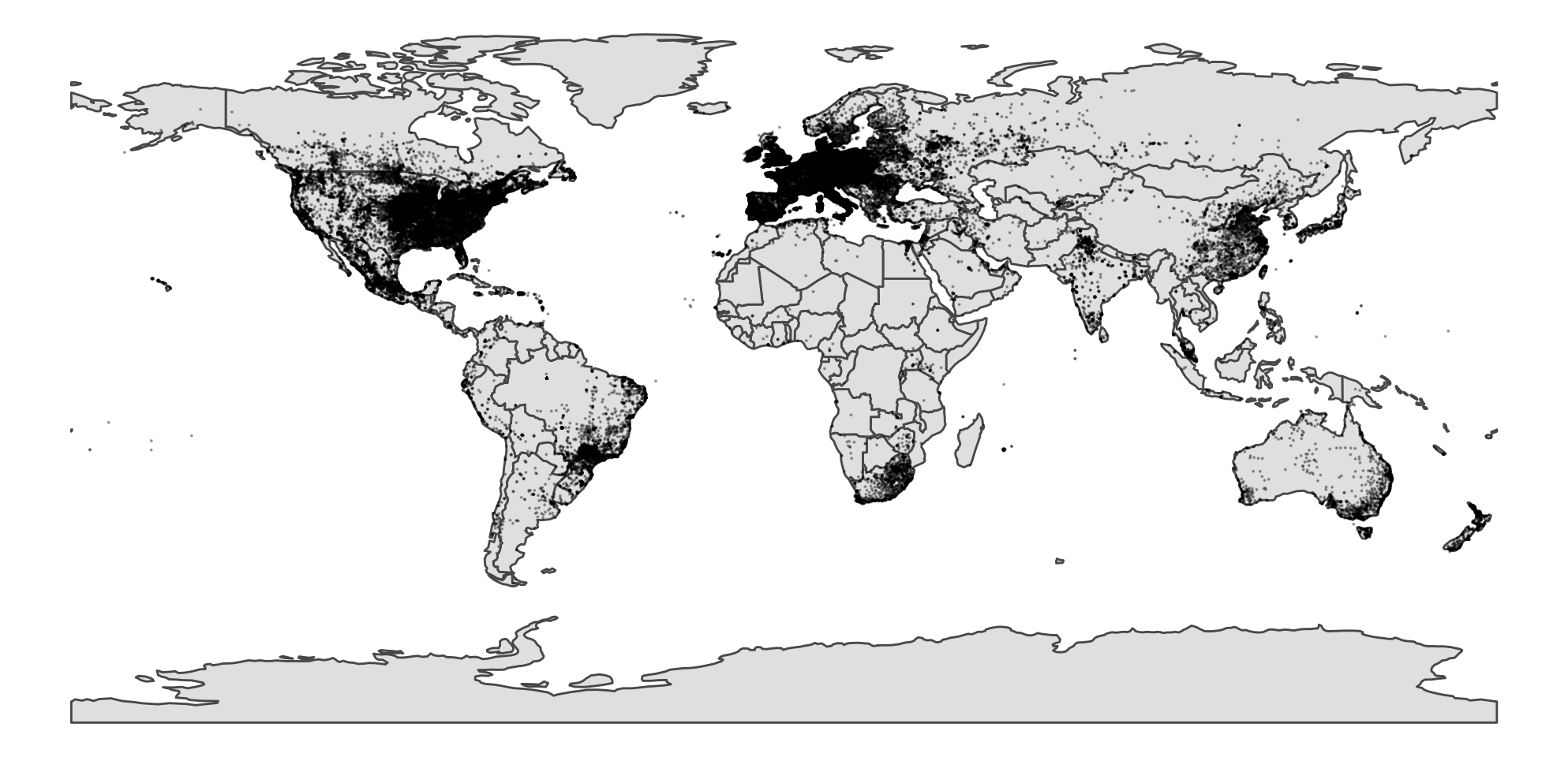
Yup, North America and Europe is just so cluttered that you really cant see what is happening here. A good way around this sort of data is by summing it up into a grid. I prefer the hexagon grid like below:
ggplot(world) +
  geom_sf() +
  stat_density_2d(data = map_data,
                  mapping = aes(x = longitude,
                                y = latitude,
                                fill = stat(density)),
                  geom = 'hex',
                  contour = FALSE,
                  alpha = 0.6) +
  scale_fill_viridis_c(option = 'magma', direction = -1) +
  theme_void()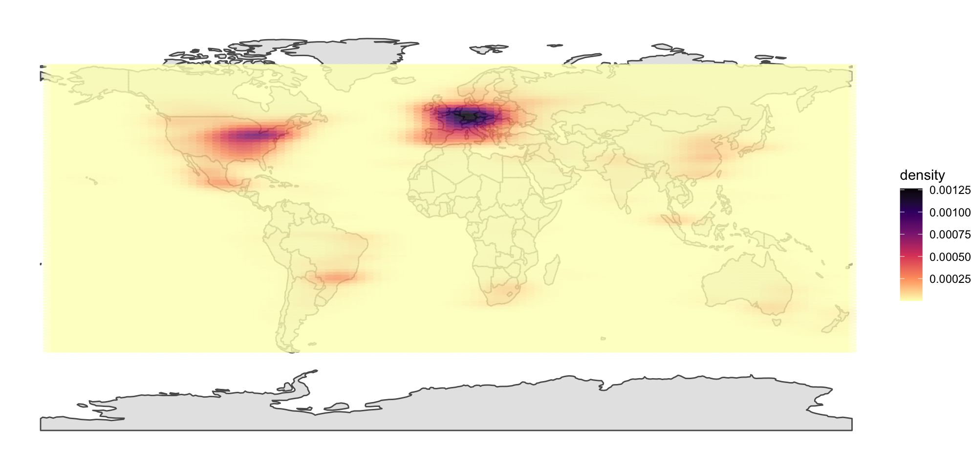
We can see smaller hotspots throughout the world!

<>
Lets see the correlation between the population served and the waste water discharge rate
WWT %>%
  dplyr::select(1,5,13,15) %>%
  ggplot(aes(x=POP_SERVED/1000,y=WASTE_DIS/1000)) +
    geom_point(size=0.6,alpha=0.3,pch=1) +
    geom_smooth(method="gam") +
    scale_x_continuous(trans="sqrt") +
    scale_y_continuous(trans="sqrt") +
    theme_bw(base_size = 15) +
    ylab("water discharge (m3 d-1) * 1000") +
    xlab("population served * 1000")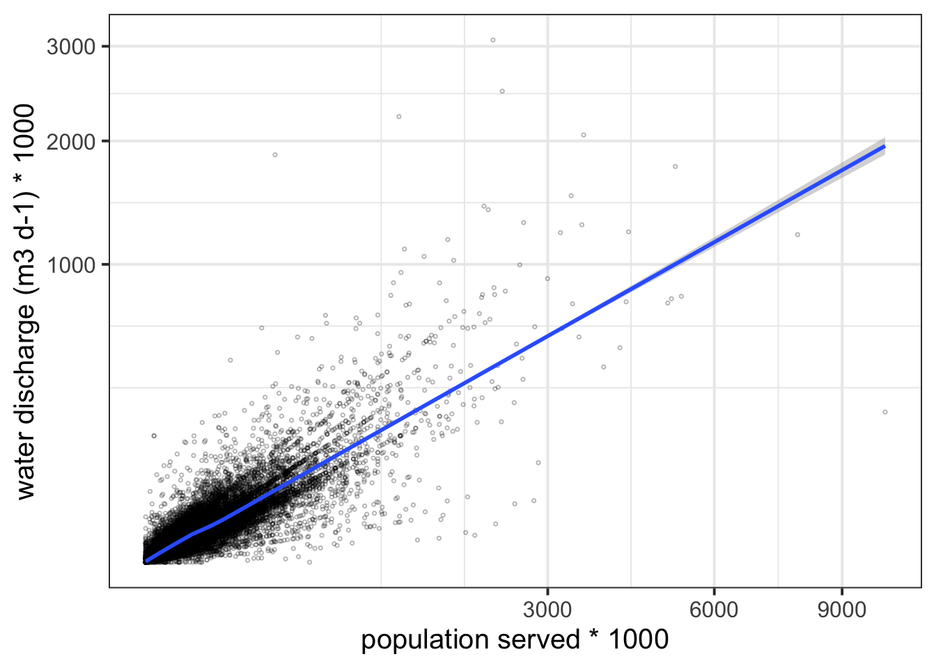
Okay that was pretty obvious although there is a fair bit of variation around the best fit line. Lets highlight some of the interesting outliers.
WWT %>%
  dplyr::select(1,4,5,13,15) %>%
  ggplot(aes(x=POP_SERVED/1000,y=WASTE_DIS/1000)) +
    geom_point() +
    gghighlight(POP_SERVED/1000 > 6000 | WASTE_DIS/1000 >2000, label_key = COUNTRY) +
    scale_x_continuous(trans="sqrt") +
    scale_y_continuous(trans="sqrt") +
    theme_bw(base_size = 15) +
    ylab("water discharge (m3 d-1) * 1000") +
    xlab("population served * 1000")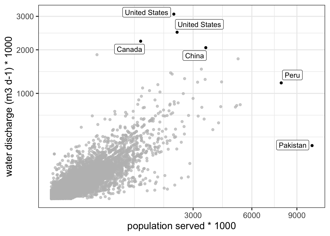
So those four waste treatment plants discharge a lot more water than expected for the population size they serve. I wonder why – prehaps industry related? On the other side, there are waste water treatment plants in Peru and Pakistan that serve a lot of people but discharge less water than expected.